Visualization Secrets of the Rock-Stars of Architecture | Courtesy of Transparent House
Over the past several years, we have looked on in fascination as Talkitect.com has organized a growing global community of individuals interested in built environments. Into this international community’s ongoing dialogue around contemporary design and architecture, we are very grateful for the opportunity to share our expertise in 3D visualization.
Talkitect.com publisher Lucas Gray recently reached out to let us know he felt that his readers would be interested in learning more about our work as a visualization studio, the relationship between designers and digital artists, how details need to flow back-and-forth, and how we actually go about performing what many view as magic. Shall we begin?
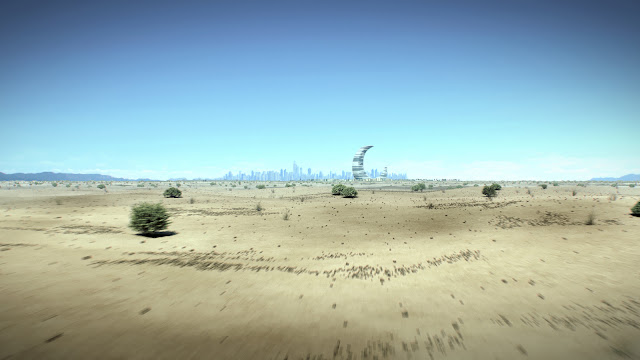
First, by way of introduction… Transparent House was launched in 2004 with offices in San Francisco, Moscow and Berlin. Today, we like to position ourselves as the next-generation creative studio exceling at the intersection of digital, art, and commerce. By specializing in the creation of stunning 3D assets, branded environments and high-end retail developments, we have built solid relationships with many of the world’s premier architects, designers and real estate developers. Although a great deal of our focus is on assisting architects through visualization, our own creative developments have also helped expand our reputation. To illustrate the ideas presented here, we are showing a project we completed entirely in-house: The Crescent Moon Tower project, which we designed for the 2009 ThyssenKrupp Architecture Competition.

In everything we do, we employ strategic digital innovation and 3D for high-profile, future-looking brands. Design and 3D are in our DNA, and our constant goal is making 3D the spectacular core of phenomenal promotional campaigns. When it comes to our client relationships, we always feel that the key is setting clear goals, because we know that the less precise the communication, the weaker the renderings will be.
In order to produce amazing renderings, we need not only architectural and other design files, we also need to know who the target audience is and what our clients are trying to communicate to them. We always say that the story comes first, which we develop the design around. Through this approach, we become a partner to the designers serving one common client. We perceive our job as filling-in whatever designers cannot; breathing life into the designs at whatever stage of development they may be at. We do this by adding rich entourage elements and creating the right atmosphere, like “busy and exciting” for a commercial retail space, or “serene relaxation” for a hospitality project.
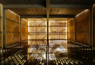
As you all surely know, Talkitect’s Lucas Gray is especially interested in the lighting aspects of visualization, and the accurate representation of shadows, streams of light, and reflections. Essentially, we always choose the type of light source or technique depending on the results we want to achieve. There are different types of lights in 3D: point lights, spot lights, area lights, direct lights, and others. To simulate the sun, we use a direct light or a special Sun light: Both give strong direct light and sharp shadows. We use Spot lights or IES lights to emit a single point of light any direction with an angle of up to 180 degrees. An IES is a more advanced spot light, where the real light information of particular lighting fixtures can be used, providing more accurate results. Area lights allow us to show big light fixtures like lamp shades, offering soft light and soft shadows.
Of course, each light source has many settings that we always leverage to the greatest effect possible. Another technique is using Image Based Lighting instead of light sources, which is especially good for product and exterior renderings. To understand this light, think about it like a big sphere with a texture on it. Finally, some materials also allow self-illumination, which can be used along with light sources to deliver incredibly nuanced looks.
Briefly, everyone understands that reflections are complex because they are produced by lights and they also depend on the characteristics of materials. Since light sources make reflections, we create some lighting setups exclusively for purposes of creating the desired reflections. This is one reason why lighting setups can be quite complex for product rendering: Some lights are used for lighting, some for reflections, and some for both. In the past, because of the lack of computing resources, we often had to “fake” some lights and reflections to make the results appear as photo-realistic as possible, but these days, we are able to simulate the properties of real light fixtures, resulting in renderings that are infinitely superior.
Most of the innovations I’ve mentioned in this quick discussion can be seen in our Tower Moon project. Providing a bit more perspective on our track-record, every day, we are educating business professionals in many industries on how they can best use 3D visualization in their daily work to "wow" their target audiences and do so in ways that are extremely cost-effective, scalable and useful. To experience our capabilities in more depth, please check-out the newest projects presented on our website or contact us for a personal demonstration.
We hope you enjoy seeing our work, which represents our continuing journey inspired by the collaborations we’ve enjoyed with our clients. Now we are just wondering what we can do for you?
---
Also check out these videos of Transparent House's work: http://www.talkitect.com/2013/02/video-dream-journey-by-transparent-house.html
---
Krista Mollion is principal and strategist for the international next-generation creative studio Transparent House. She joined the company soon after its inception, after handling project management assignments for Autodesk, Siebel Systems and many other leading high-tech companies. With her international business experience, Krista encourages clients to think big about ways to expand into new markets by maximizing the ever-expanding benefits of 3D visualization.


