The New Cooper Union and the Mechanics of Architecture
by Uriel Ortega
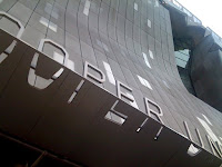 Walking around the streets of the East Village in lower Manhattan and it's hard to miss the newly renovated Cooper Union building, a machine-like structure that appears so out of-context that its surroundings suddenly seem to fade away. A vision that intuitively makes one approach with caution, as if the machine, the building, were to transform into something broader, taller, and otherworldly and catapult the East Village into a frenzied darkness. This fleeting feeling is merely a mirage, the building does not transform itself, though it has the ability to transform your sensibilities to an architecture that is not immediately digestible. The new Cooper Union academic building, designed by the architect Thom Mayne and his firm Morphosis, will, without a doubt, transform Cooper Square, but what it achieves on a grander level is reform our understanding of that quiescent relationship between building envelope and public space, that contiguous zone around every building that is too often overlooked.
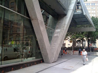 Anchoring the east side of the square, the new Cooper manages to moderately engage that ignored, awkward space, creating a playful buffer between the enclosure and the sidewalk. Zaha Hadid’s Contemporary Arts Center in Cincinnati comes to mind as a recent example of an architecture that successfully blurs the inside/outside relationship - that unites public and private urban space. In her design a concrete wall lines the entire length of the interior and emerges past a glass enclosed lobby, living simultaneously inside and out. Separated solely by a thin transparent plane, the wall is further articulated to morph into the ground to become a piece of the urban landscape, a swoop and gesture that made skateboarders rejoice. However, the new Cooper isn’t quite as poetic as Hadid’s Arts Center, rather it is forceful and abrasive. Diagonal columns vigorously emerge from the body of the building and crash into the sidewalk floor as they interlock and converge with other columns. These structural elements slice up the urban fabric and create smaller scaled pockets of space between themselves and the enclosed ground level. This interaction is done at such a restrained and sophisticated level that it succeeds in merely suggesting, but not completely promoting, human interaction. Furthermore, by allowing the structure to exist outside, the building has avoided becoming a heavy architectural manifestation that sits static, like a motionless, industrial lump. With its structure in consequential tension, and despite its heavy presence, this machine appears to rest lightly on the site. What the new Cooper evokes is the appearance of having been built in reverse - assembled down to the ground and not from the ground-up. Almost like a nest, the sticks of concrete seem to have been dropped into a metal box, tumbling and settling into their final and steady position.
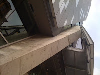 The building sits on its own lot, with no immediate adjacency to other buildings, a rare treat in the built environment of New York. Above ground level, a vast sea of densely perforated steel panels shelters the inner world of the new Cooper from the neighborhood, or perhaps it’s the other way around. This screen behaves like a skin that wraps the structural diagonals that pierce into the innards of the building’s body. It becomes a delicate system of metal that presents itself as thick, heavy and impenetrable. Perhaps this is why the restricted openings through the skin allude to forceful cuts or gashes - the few places where windows emerge unprotected by the enclosing metal. Throughout most of the building views in from the outside are seemingly impossible while windows hidden behind the skin enjoy views of the day lit surroundings. This effect is reversed at night as illuminated interior studios glow through the mesh and animate the facade.
 The main gash, on the façade that fronts Cooper Square, is a significant vertical wound that branches off into two opposing horizontals, revealing the inner anatomy of glass and concrete. This opening is one of the very few moments where viewers are allowed to glance into the heart of this machine - revealing segments of those diagonal concrete sticks and the intricate circulation structure. While the primary façade folds and distorts along its wounds, the other three facades remain static and unfortunately flat. Without any folds or creases, and when the sun hides behind the clouds, the skin takes on the appearance of solid concrete. In the end, what spares these relentless facades from banality is the applied sub-system of smaller, coated rectangles that corner some of the screen panels. It is a moderate system that assists in humanizing the buildings by creating a human-scaled element that visitors and passers-by can relate to. As a unique side effect, when the sun pierces through the clouds, these coated rectangles have the same reflective quality as water, giving a new life to the facade.
 Reflection, both literal and metaphysical, must play an important role if this design is to coexist with a neighborhood that is unfamiliar with this type of architecture. At the rear of the building is a framed opening that strategically reflects the dome of an adjacent temple. So when at first this machine, this building made its surroundings disappear, now glimpses reappear as elements of the design, if only briefly. It is these few moments that permit this building to succeed as a contemporary work of architecture rooted in context, and prevent it from becoming another in a seemingly endless line of self-indulgent designs by architects thoroughly obsessed with form and aesthetic. Unlike Daniel Libeskind’s Denver Art Museum, another highly publicized design appearing gravely alien to its surroundings, the new Cooper has at least managed to somewhat reflect its surroundings and create an architecture with layered intricacy, external references and substance. The aesthetic Thom Mayne introduces to New York with the new Cooper seems more suited to this urban environment than to the sprawling cities of the West Coast, where the majority of his oeuvre is concentrated. The highly layered approach to architecture, the non-iconic, and the non-box feels somewhat at home in the East Village, a place of richly veneered creative and dynamic energy - a place with an intricate layered history.
 The new Cooper inhabits a cool gray area, a dualistic space of identity. It is formless, yet formed. Able to be both exclusive and inclusive, it is a work of architecture that presses outward and pulls inward. Even though some have already labelled it an eyesore, it has undoubtedly brought a freshness to an area that was content with the status quo. Some have even likened it to a car wreck, but oh, what a car wreck that must have been! Even with its imperfections, it flaunts its dents and gashes with pride, anticipating your personal, and the surrounding neighborhood's metamorphosis.

 Walking around the streets of the East Village in lower Manhattan and it's hard to miss the newly renovated Cooper Union building, a machine-like structure that appears so out of-context that its surroundings suddenly seem to fade away. A vision that intuitively makes one approach with caution, as if the machine, the building, were to transform into something broader, taller, and otherworldly and catapult the East Village into a frenzied darkness. This fleeting feeling is merely a mirage, the building does not transform itself, though it has the ability to transform your sensibilities to an architecture that is not immediately digestible. The new Cooper Union academic building, designed by the architect Thom Mayne and his firm Morphosis, will, without a doubt, transform Cooper Square, but what it achieves on a grander level is reform our understanding of that quiescent relationship between building envelope and public space, that contiguous zone around every building that is too often overlooked.
 Anchoring the east side of the square, the new Cooper manages to moderately engage that ignored, awkward space, creating a playful buffer between the enclosure and the sidewalk. Zaha Hadid’s Contemporary Arts Center in Cincinnati comes to mind as a recent example of an architecture that successfully blurs the inside/outside relationship - that unites public and private urban space. In her design a concrete wall lines the entire length of the interior and emerges past a glass enclosed lobby, living simultaneously inside and out. Separated solely by a thin transparent plane, the wall is further articulated to morph into the ground to become a piece of the urban landscape, a swoop and gesture that made skateboarders rejoice. However, the new Cooper isn’t quite as poetic as Hadid’s Arts Center, rather it is forceful and abrasive. Diagonal columns vigorously emerge from the body of the building and crash into the sidewalk floor as they interlock and converge with other columns. These structural elements slice up the urban fabric and create smaller scaled pockets of space between themselves and the enclosed ground level. This interaction is done at such a restrained and sophisticated level that it succeeds in merely suggesting, but not completely promoting, human interaction. Furthermore, by allowing the structure to exist outside, the building has avoided becoming a heavy architectural manifestation that sits static, like a motionless, industrial lump. With its structure in consequential tension, and despite its heavy presence, this machine appears to rest lightly on the site. What the new Cooper evokes is the appearance of having been built in reverse - assembled down to the ground and not from the ground-up. Almost like a nest, the sticks of concrete seem to have been dropped into a metal box, tumbling and settling into their final and steady position.
 The building sits on its own lot, with no immediate adjacency to other buildings, a rare treat in the built environment of New York. Above ground level, a vast sea of densely perforated steel panels shelters the inner world of the new Cooper from the neighborhood, or perhaps it’s the other way around. This screen behaves like a skin that wraps the structural diagonals that pierce into the innards of the building’s body. It becomes a delicate system of metal that presents itself as thick, heavy and impenetrable. Perhaps this is why the restricted openings through the skin allude to forceful cuts or gashes - the few places where windows emerge unprotected by the enclosing metal. Throughout most of the building views in from the outside are seemingly impossible while windows hidden behind the skin enjoy views of the day lit surroundings. This effect is reversed at night as illuminated interior studios glow through the mesh and animate the facade.
 The main gash, on the façade that fronts Cooper Square, is a significant vertical wound that branches off into two opposing horizontals, revealing the inner anatomy of glass and concrete. This opening is one of the very few moments where viewers are allowed to glance into the heart of this machine - revealing segments of those diagonal concrete sticks and the intricate circulation structure. While the primary façade folds and distorts along its wounds, the other three facades remain static and unfortunately flat. Without any folds or creases, and when the sun hides behind the clouds, the skin takes on the appearance of solid concrete. In the end, what spares these relentless facades from banality is the applied sub-system of smaller, coated rectangles that corner some of the screen panels. It is a moderate system that assists in humanizing the buildings by creating a human-scaled element that visitors and passers-by can relate to. As a unique side effect, when the sun pierces through the clouds, these coated rectangles have the same reflective quality as water, giving a new life to the facade.
 Reflection, both literal and metaphysical, must play an important role if this design is to coexist with a neighborhood that is unfamiliar with this type of architecture. At the rear of the building is a framed opening that strategically reflects the dome of an adjacent temple. So when at first this machine, this building made its surroundings disappear, now glimpses reappear as elements of the design, if only briefly. It is these few moments that permit this building to succeed as a contemporary work of architecture rooted in context, and prevent it from becoming another in a seemingly endless line of self-indulgent designs by architects thoroughly obsessed with form and aesthetic. Unlike Daniel Libeskind’s Denver Art Museum, another highly publicized design appearing gravely alien to its surroundings, the new Cooper has at least managed to somewhat reflect its surroundings and create an architecture with layered intricacy, external references and substance. The aesthetic Thom Mayne introduces to New York with the new Cooper seems more suited to this urban environment than to the sprawling cities of the West Coast, where the majority of his oeuvre is concentrated. The highly layered approach to architecture, the non-iconic, and the non-box feels somewhat at home in the East Village, a place of richly veneered creative and dynamic energy - a place with an intricate layered history.
 The new Cooper inhabits a cool gray area, a dualistic space of identity. It is formless, yet formed. Able to be both exclusive and inclusive, it is a work of architecture that presses outward and pulls inward. Even though some have already labelled it an eyesore, it has undoubtedly brought a freshness to an area that was content with the status quo. Some have even likened it to a car wreck, but oh, what a car wreck that must have been! Even with its imperfections, it flaunts its dents and gashes with pride, anticipating your personal, and the surrounding neighborhood's metamorphosis.


