Admiration for Gehry
A review of the DZ Bank Building, Pariser Platz, Berlin
By Lucas Gray
 Always a controversial figure in architecture circles Frank Gehry has a body of work that is bold, creative, and somewhat bizarre. Love or hate his designs you have to admire the fact that he gets people to talk about architecture and for this we all should thank him. He brings discussions of architecture into the average person’s life with his wacky titanium clad curves. His structures are also destinations for travelers and tourists. Many people make it a point to visit his buildings when they are in a particular city or region. Although I can’t say I am a fan of his work I still am interested to experience his buildings first hand when presented with the opportunity.
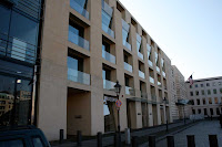
The most recent Gehry design I visited was actually a remarkable surprise. The DZ Bank in Berlin, behind the Brandenburg Gate and overlooking Pariser Platz, is an incredibly muted building on the exterior. Its façade consists of large windows punched through a sheet of limestone. The top floor is set back to provide a terrace that overlooks the plaza. Simple squares evenly paced across the face of the building. Strict parameters were forced on the design due to its Historical surroundings.
 This simple façade belies the typical Gehry forms, which explode within the interior atrium. Enter the building and from the dark lobby you are presented with view that makes you forget the almost boring façade. A morphing glass vault allows ample daylight to wash over the floating titanium clad conference room and sparkle off a blobular glass roof to a subterranean events hall. Bridges flow in and round these objects while the warm wood covered walls relate back to the simple grid of the exterior. With the simplistic background the crazy curves and blobs actually come alive and make the space special. It is easily understood what functions are located where and how the choreography of the space works – something often missing in other Gehry buildings I have visited. As I stood behind the security line and snapped some photographs I started to enjoy the playfulness of the design and admired the risk of bringing this to such a typically conservative organization, a bank.
 For this visit I purposely made my way across Berlin to get a view of the atrium space. However, my first experience with the building was more of an accident. I was visiting the Holocaust memorial on a sunny fall day not knowing that the Gehry building was close by. See, the building truly has 2 fronts, the bank faces the Pariser Platz while the second programmatic requirement - high-end apartments – faces south with stunning views over the Eisenman designed memorial. This southern façade also gives a hint of Gehry’s tendency for drama. Here the wall of the same creamy limestone steps back as it rises while gently bending and folding to create a curtain like movement to the stone wall. Again, large windows are punched out and recessed to provide each apartment with a balcony overlooking the field of concrete pillars. It is relatively sober compared to the usual Gehry gaudiness but in its restraint I believe it compliments its surrounding environment and becomes an admiral addition to the heart of Berlin.
By Lucas Gray
 Always a controversial figure in architecture circles Frank Gehry has a body of work that is bold, creative, and somewhat bizarre. Love or hate his designs you have to admire the fact that he gets people to talk about architecture and for this we all should thank him. He brings discussions of architecture into the average person’s life with his wacky titanium clad curves. His structures are also destinations for travelers and tourists. Many people make it a point to visit his buildings when they are in a particular city or region. Although I can’t say I am a fan of his work I still am interested to experience his buildings first hand when presented with the opportunity.
 The most recent Gehry design I visited was actually a remarkable surprise. The DZ Bank in Berlin, behind the Brandenburg Gate and overlooking Pariser Platz, is an incredibly muted building on the exterior. Its façade consists of large windows punched through a sheet of limestone. The top floor is set back to provide a terrace that overlooks the plaza. Simple squares evenly paced across the face of the building. Strict parameters were forced on the design due to its Historical surroundings.
 This simple façade belies the typical Gehry forms, which explode within the interior atrium. Enter the building and from the dark lobby you are presented with view that makes you forget the almost boring façade. A morphing glass vault allows ample daylight to wash over the floating titanium clad conference room and sparkle off a blobular glass roof to a subterranean events hall. Bridges flow in and round these objects while the warm wood covered walls relate back to the simple grid of the exterior. With the simplistic background the crazy curves and blobs actually come alive and make the space special. It is easily understood what functions are located where and how the choreography of the space works – something often missing in other Gehry buildings I have visited. As I stood behind the security line and snapped some photographs I started to enjoy the playfulness of the design and admired the risk of bringing this to such a typically conservative organization, a bank.


